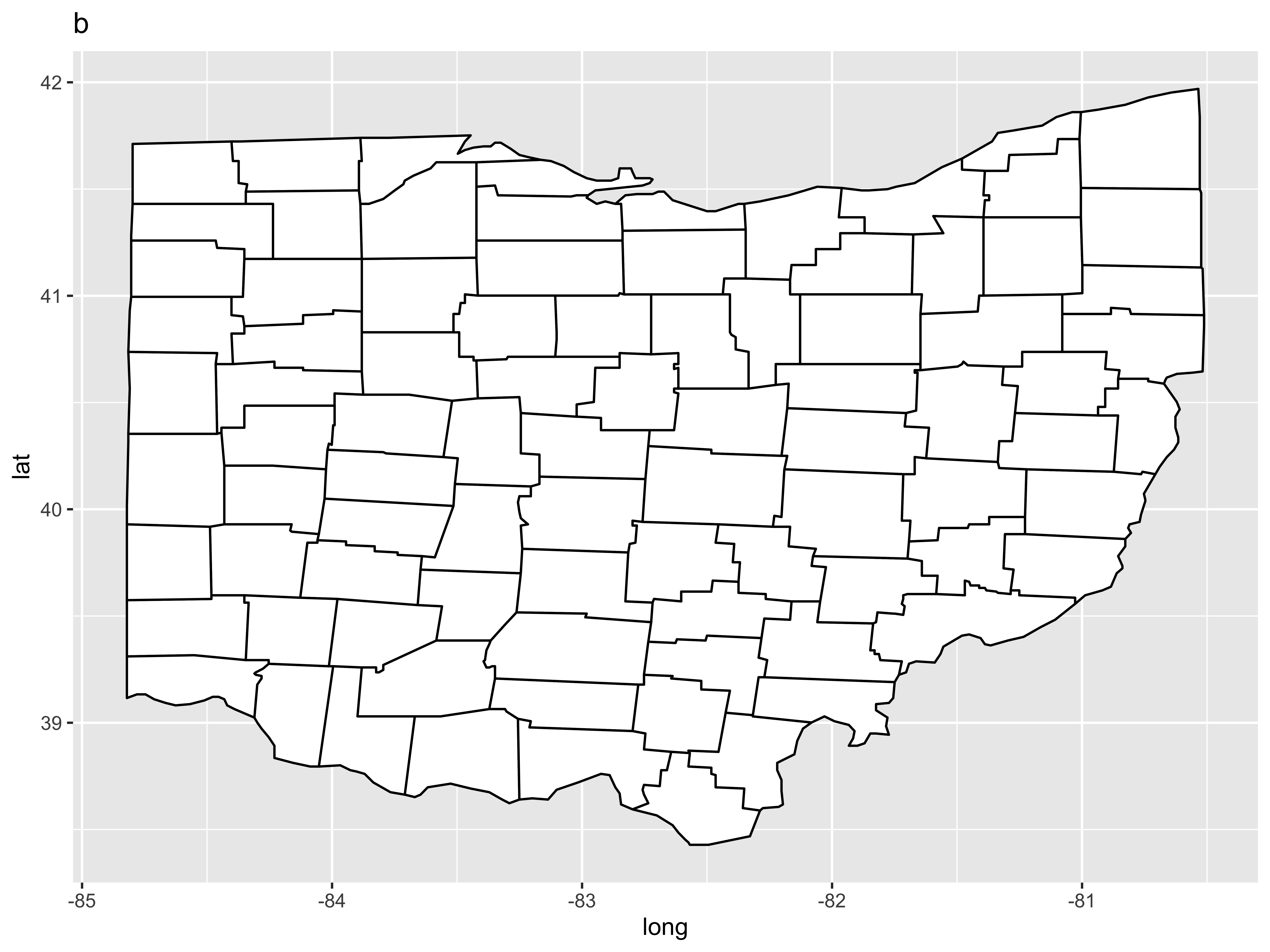
ggplot() + geom_polygon(data = oh, aes(x = long, y = lat), fill = "white", color = "black") + ggtitle("a") # bad ggplot() + geom_polygon(data = oh, aes(x = long, y = lat, group = group), fill = "white", color = "black") + ggtitle("b") # a slightly better basic map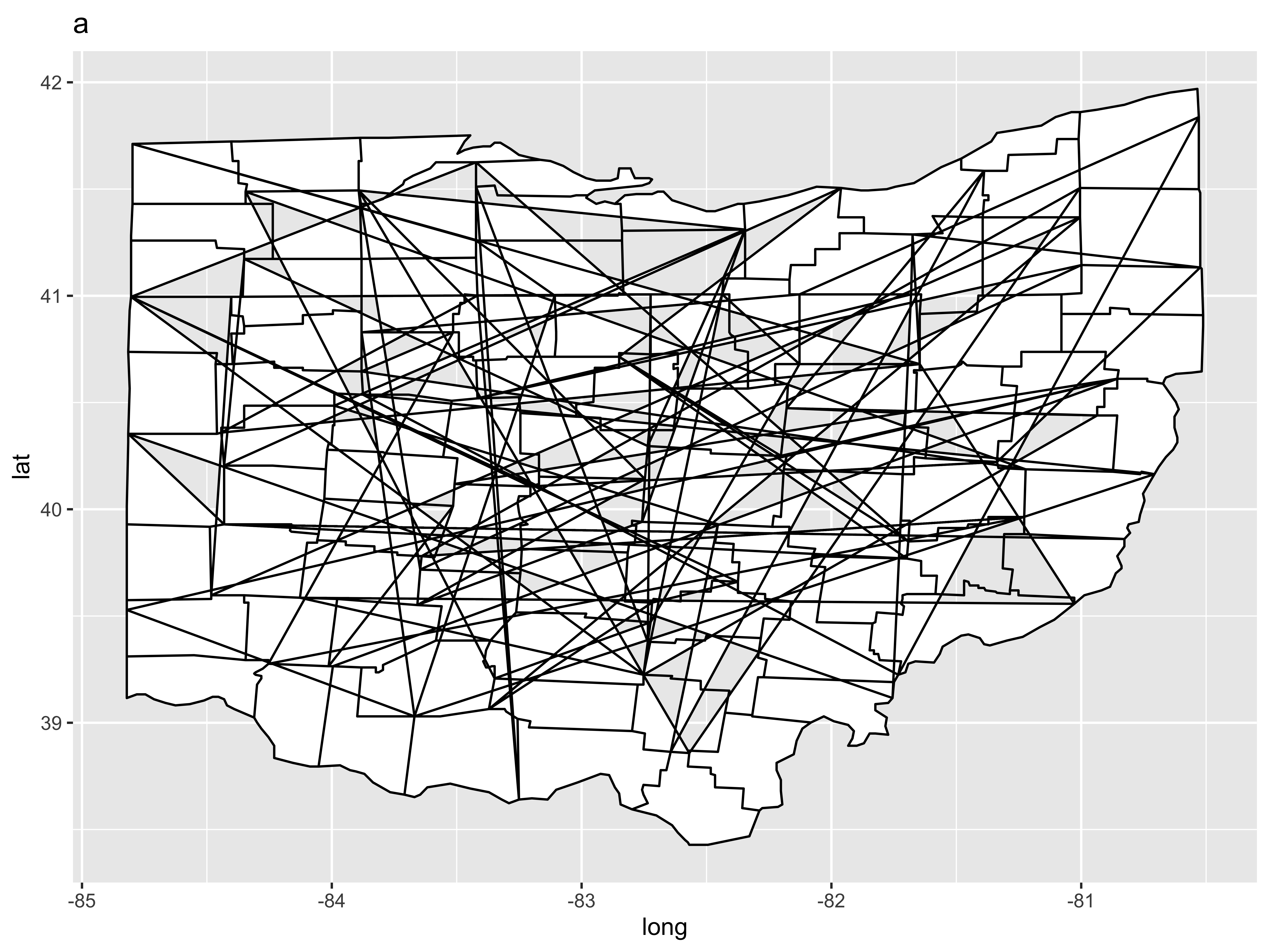
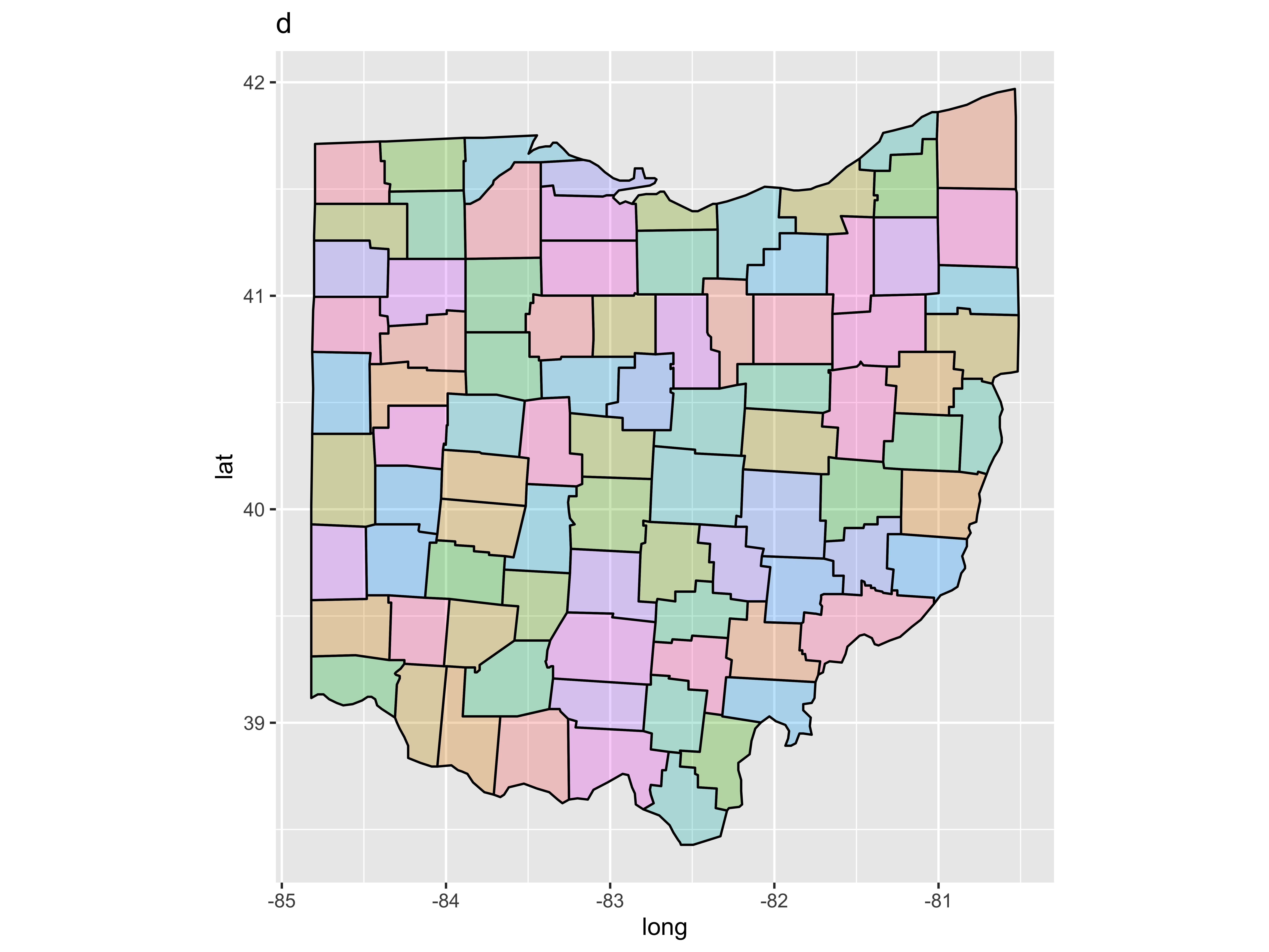
ggplot() + geom_polygon(data = oh, aes(x = long, y = lat, group = group), fill = "white", color = "black") + coord_fixed(1.3) + ggtitle("c") # a better map ggplot() + geom_polygon(data = oh, aes(x = long, y = lat, group = group, fill = subregion), color = "black", alpha = 0.3) + coord_fixed(1.3) + guides(fill = FALSE) + ggtitle("d") # a colored map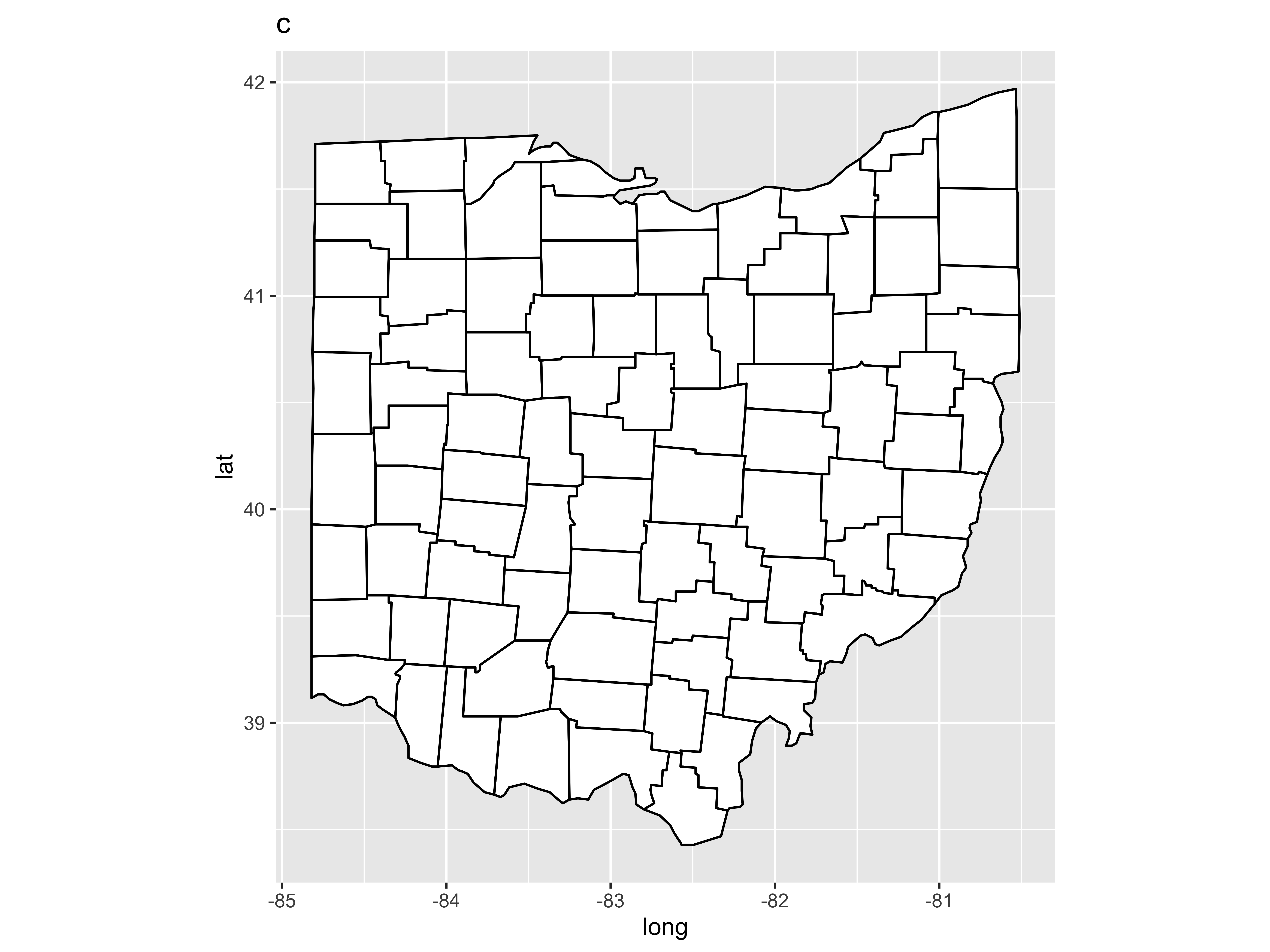
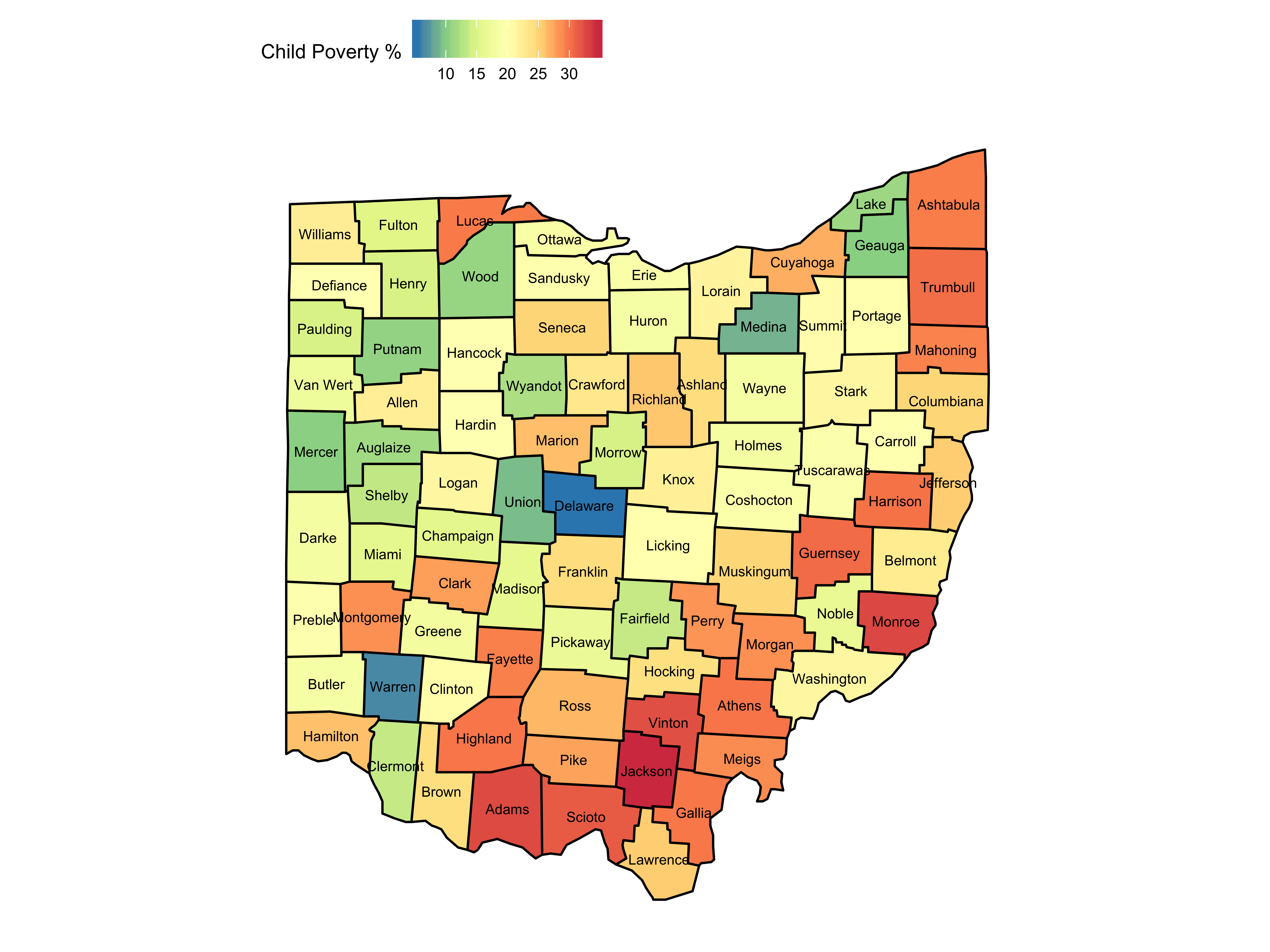
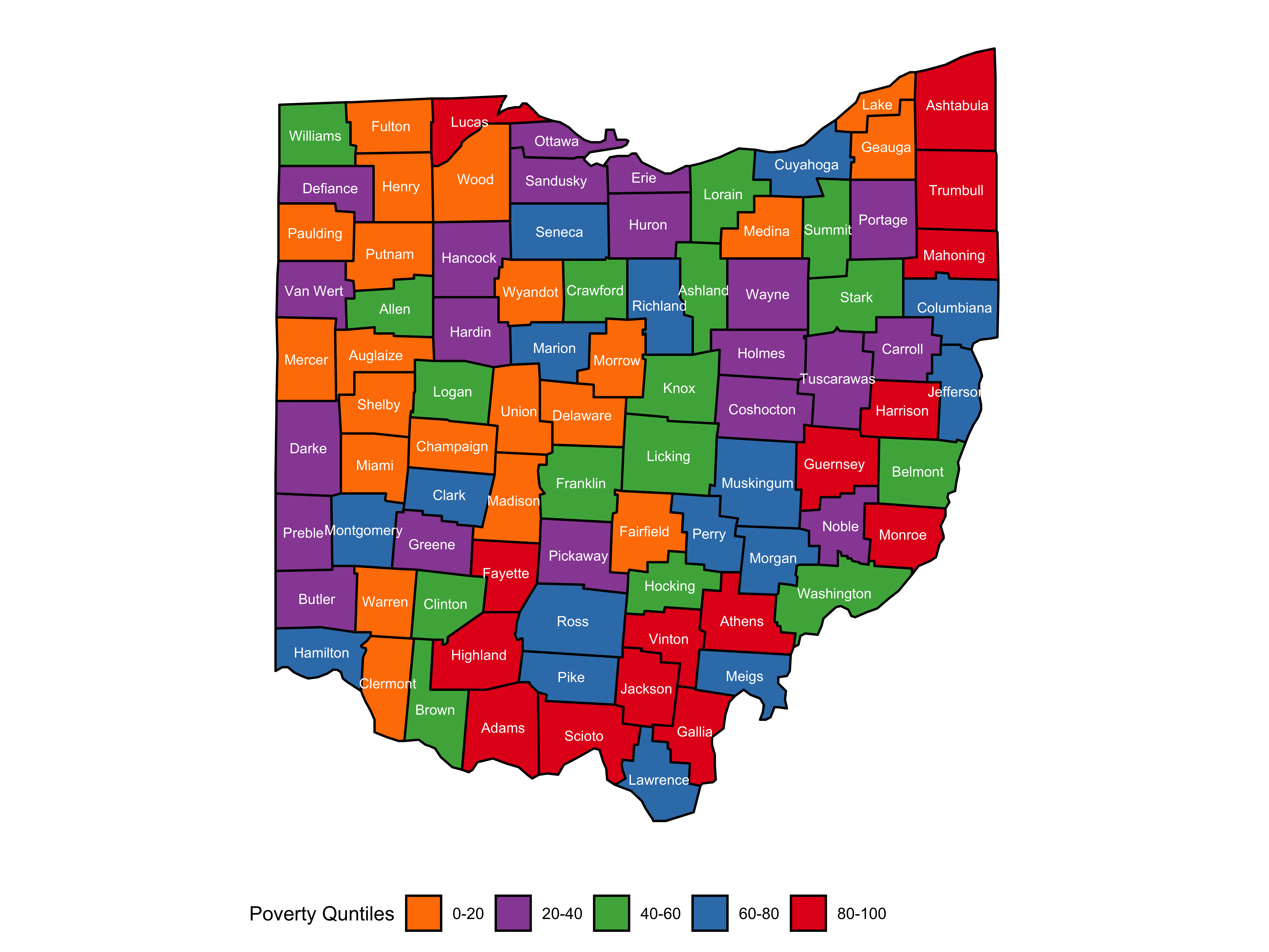
... and the plot itself
... and now the map itself
library(tidyverse)library(urbnmapr)states %>% ggplot(aes(long, lat, group = group)) + geom_polygon(fill = "grey", color = "#ffffff", size = 0.25) + coord_map(projection = "albers", lat0 = 39, lat1 = 45)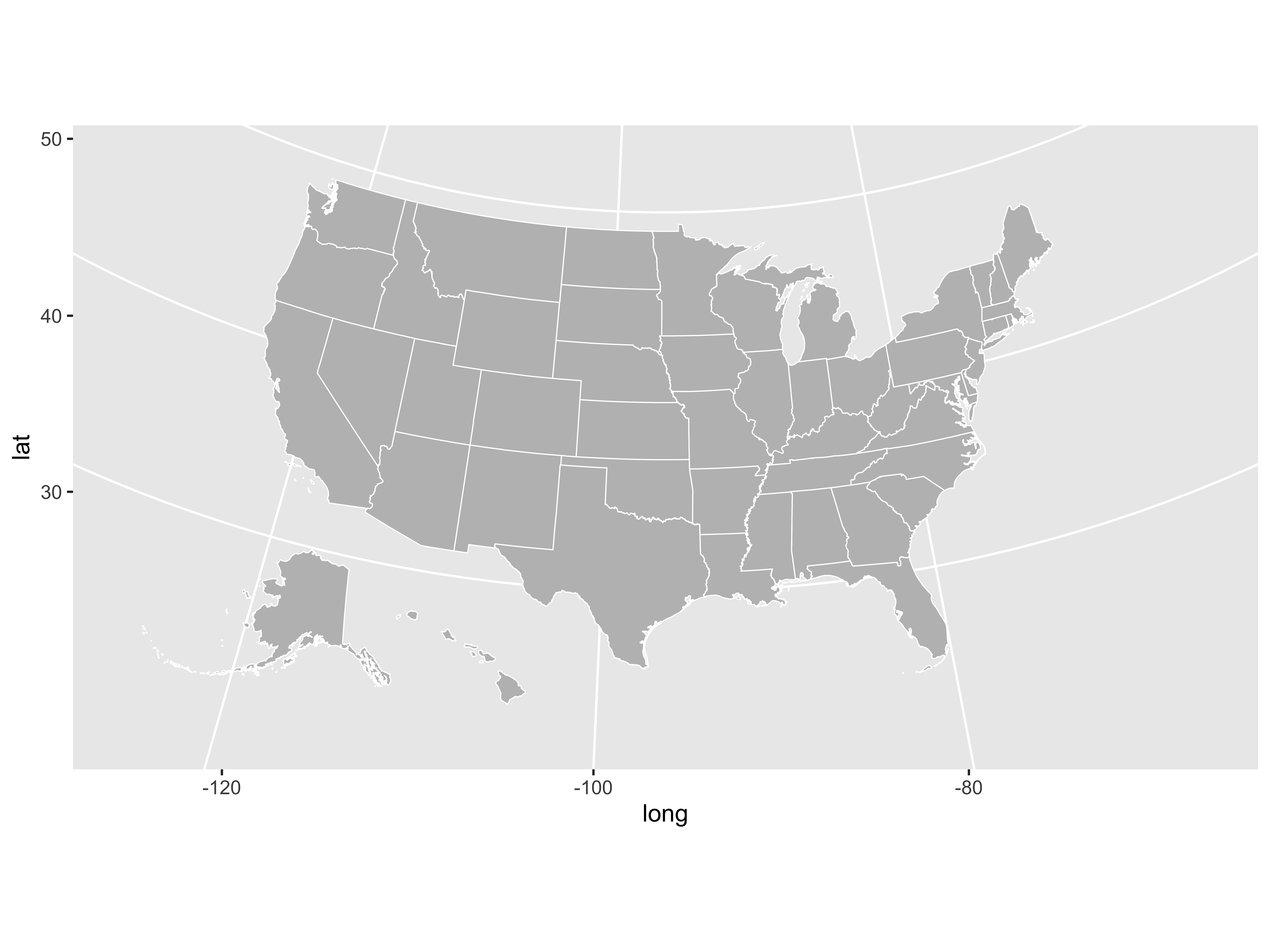
counties %>% ggplot(aes(long, lat, group = group)) + geom_polygon(fill = "grey", color = "#ffffff", size = 0.05) + coord_map(projection = "albers", lat0 = 39, lat1 = 45)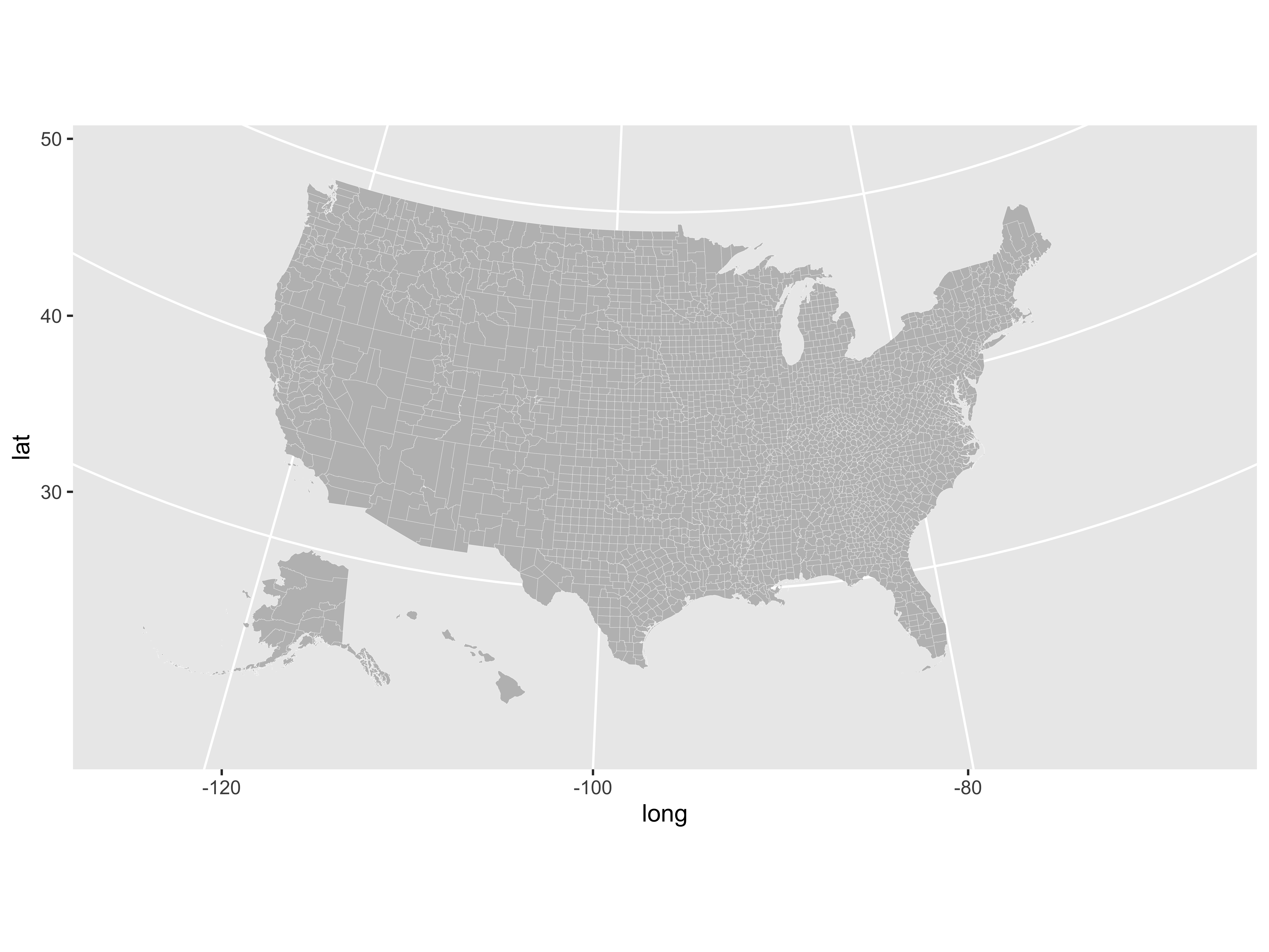
Often when you are building a visualization you end up needing to squeeze multiple graphics into a single canvas, like the example below
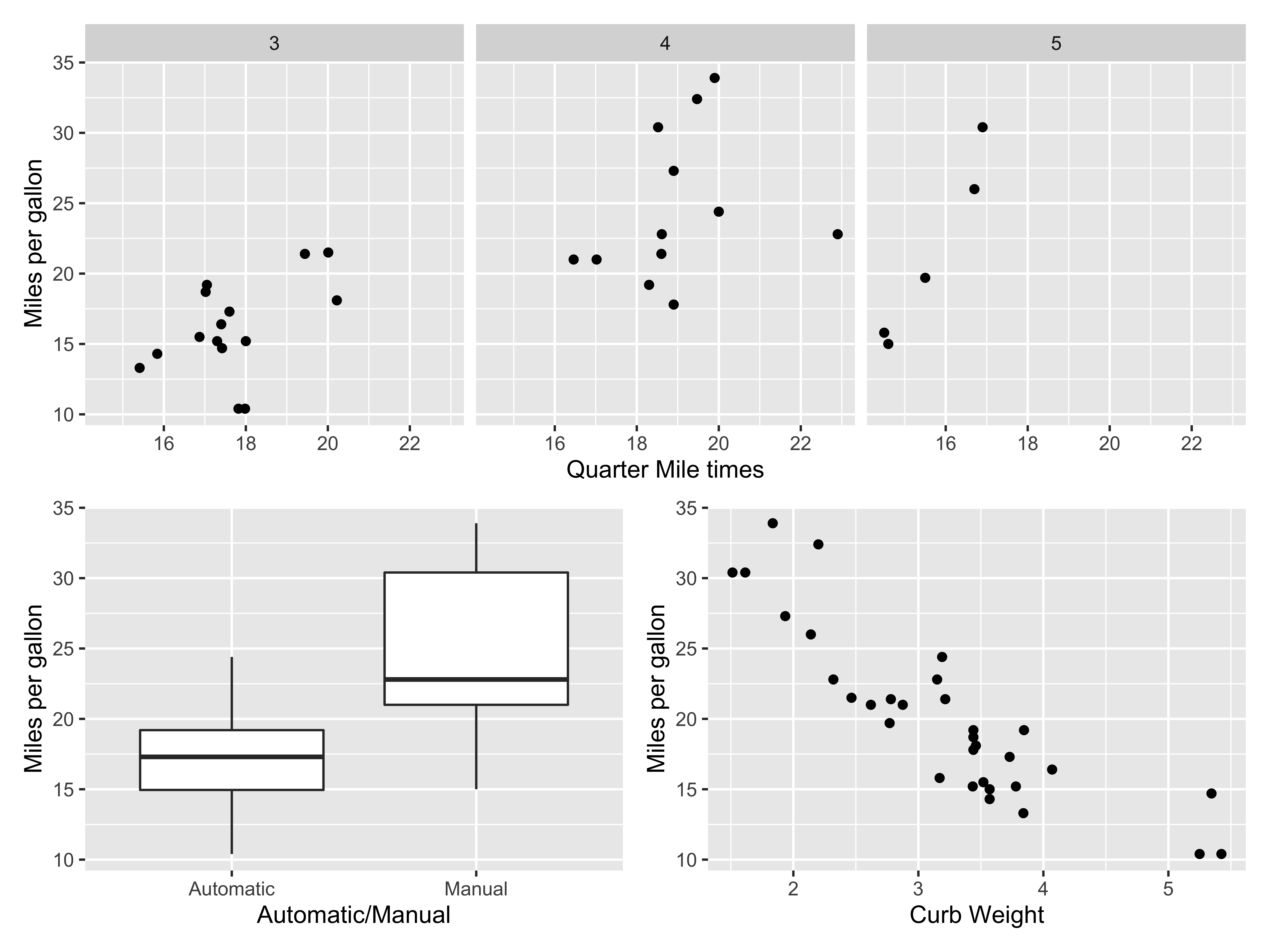
p1 + p2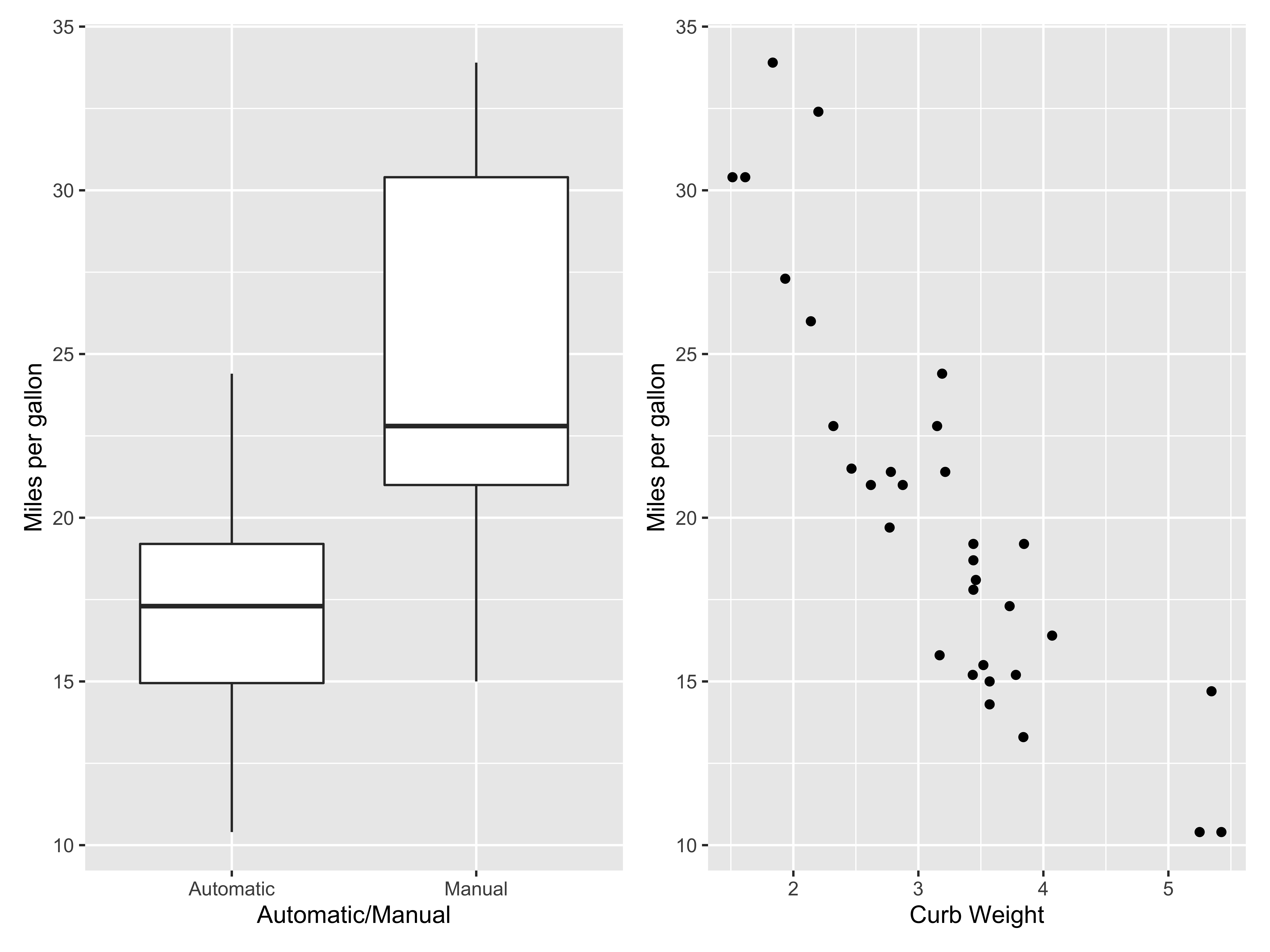
p1 + p2 + plot_layout(ncol = 1)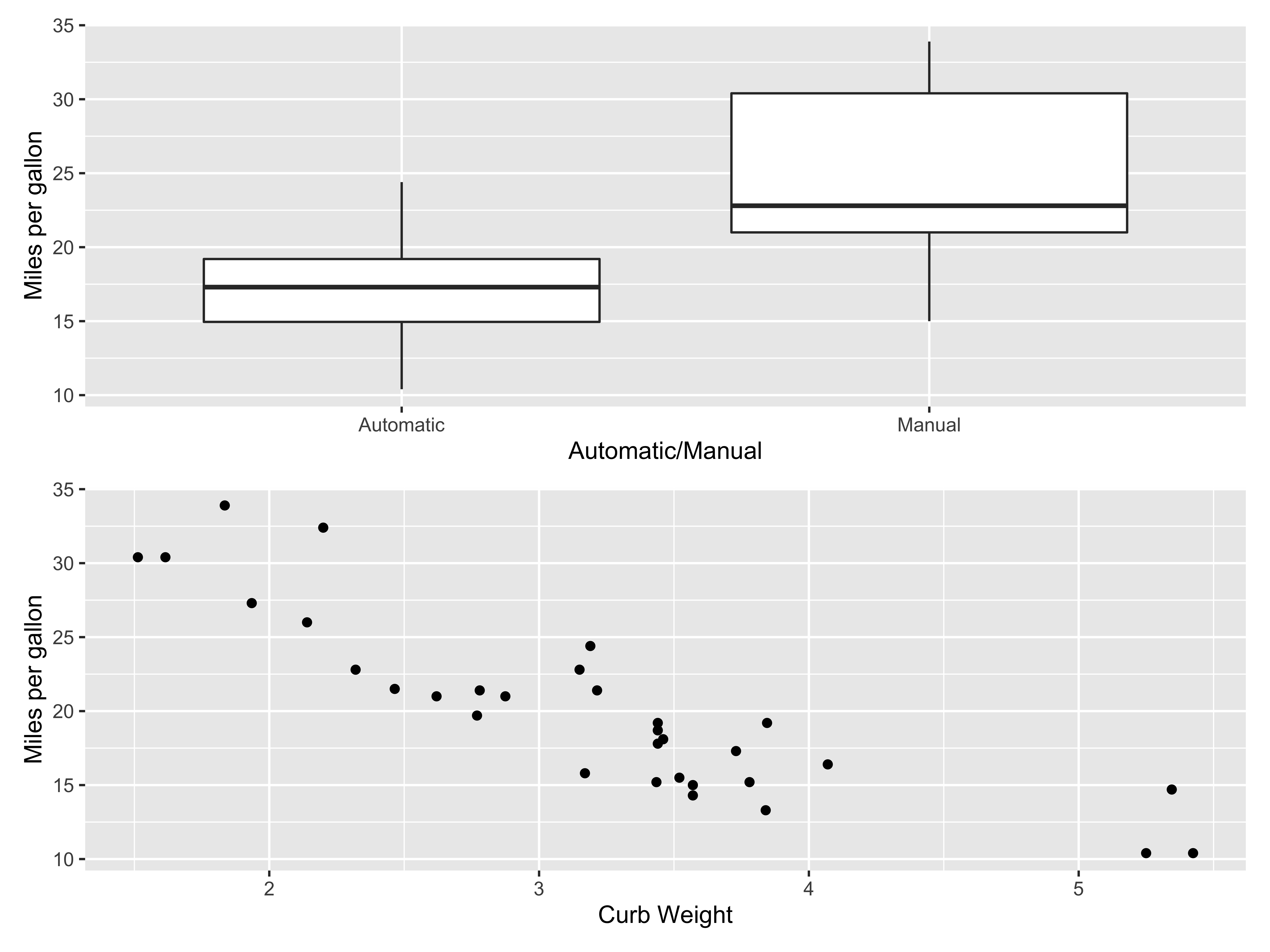
plot_layout() has several options, key ones will be
ncol,nrow: number of columns/rowsbyrow: how should the plots be embedded, by filling columns first or by filling rows firstwidths,heights: relative widths/heights of each column and row in the grid. Will get repeated to match the dimensions of the grid.
fill row 1 with p1, p2, then row 2 with p1, p2
p1 + p2 + p1 + p2 + plot_layout(ncol = 2, byrow = TRUE)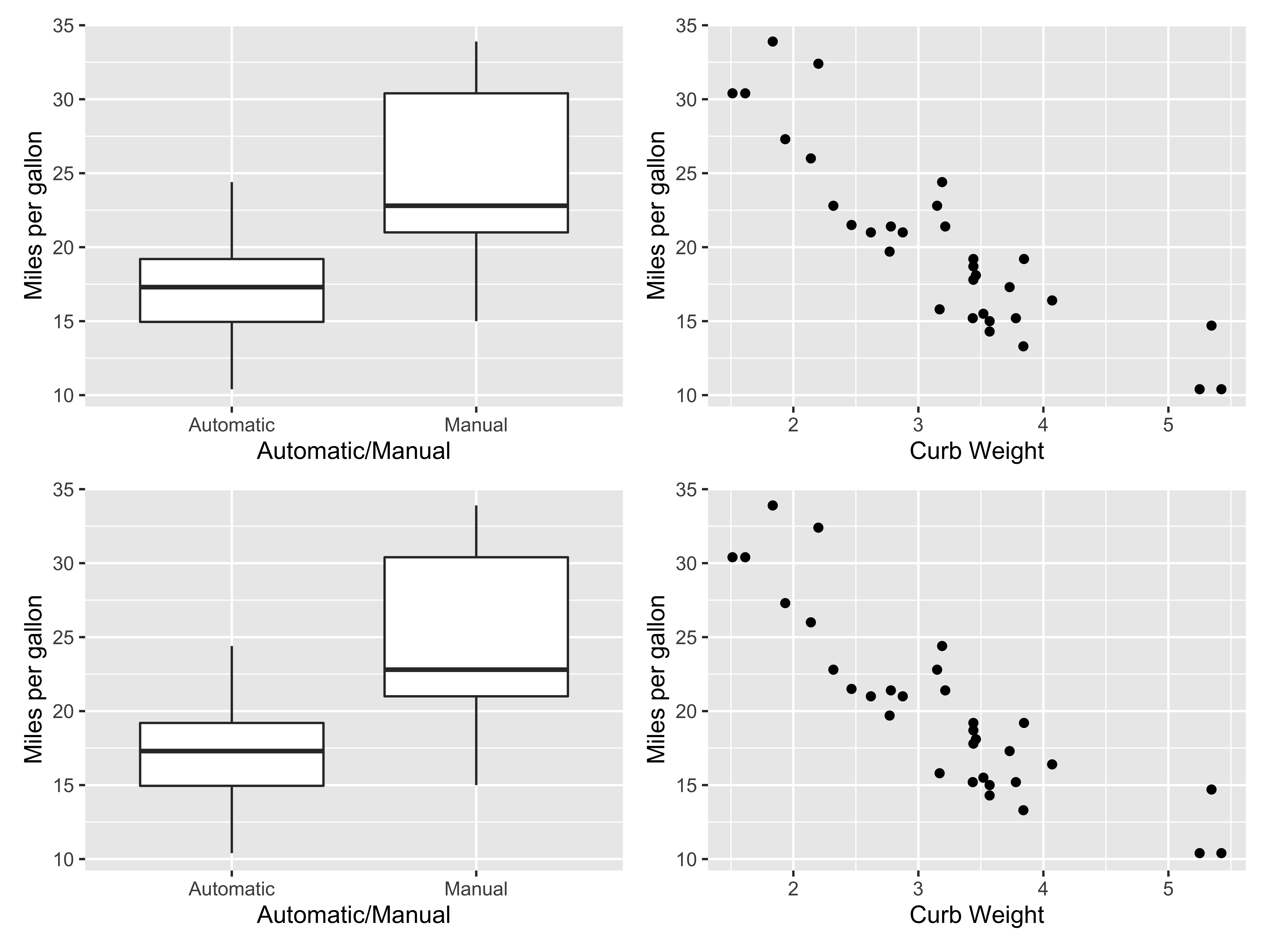
fill column 1 with p1, p2, then column 2 with p1, p2
p1 + p2 + p1 + p2 + plot_layout(ncol = 2, byrow = FALSE)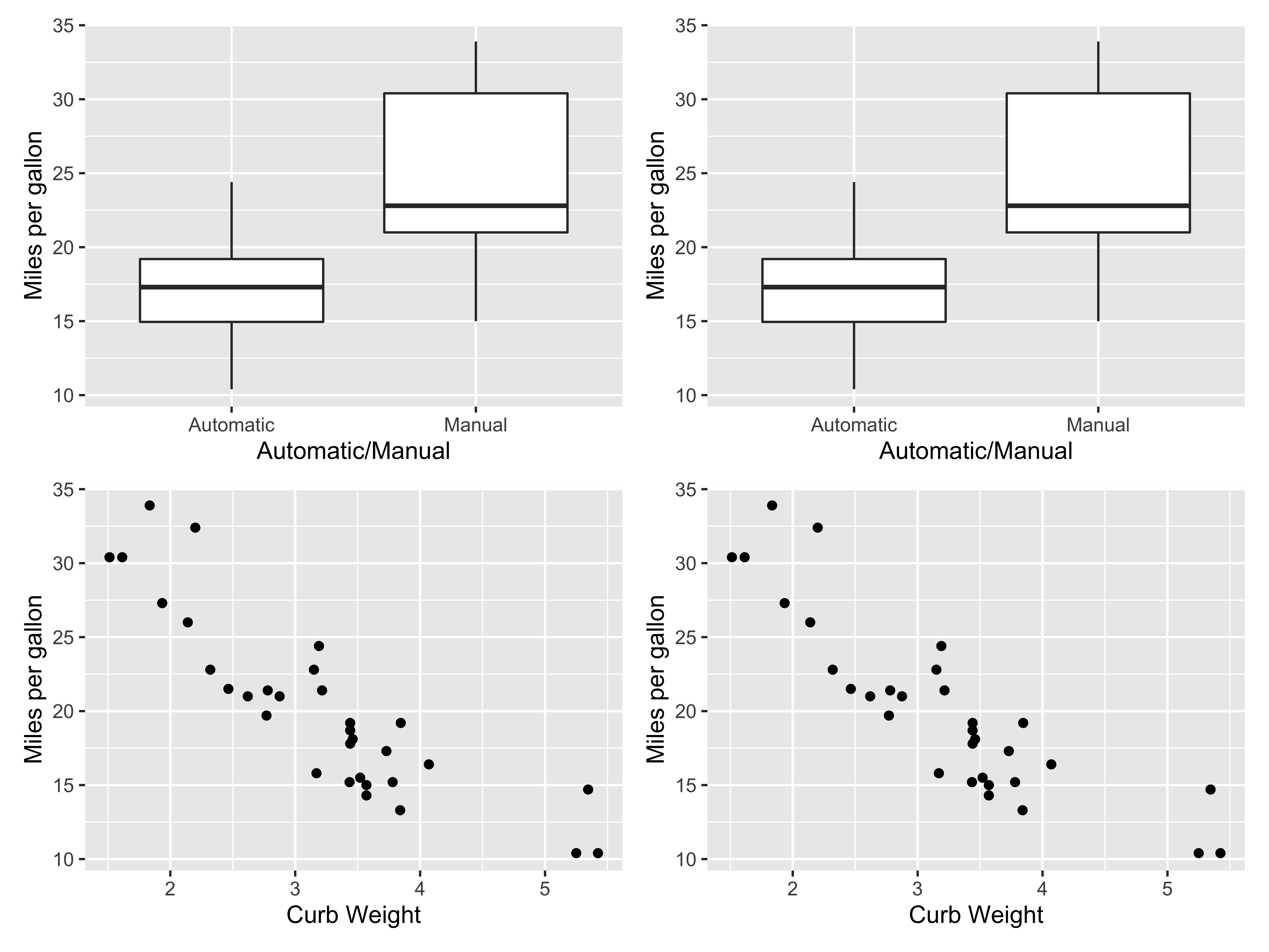
(p1 + (p2 + p3) + plot_layout(ncol = 1))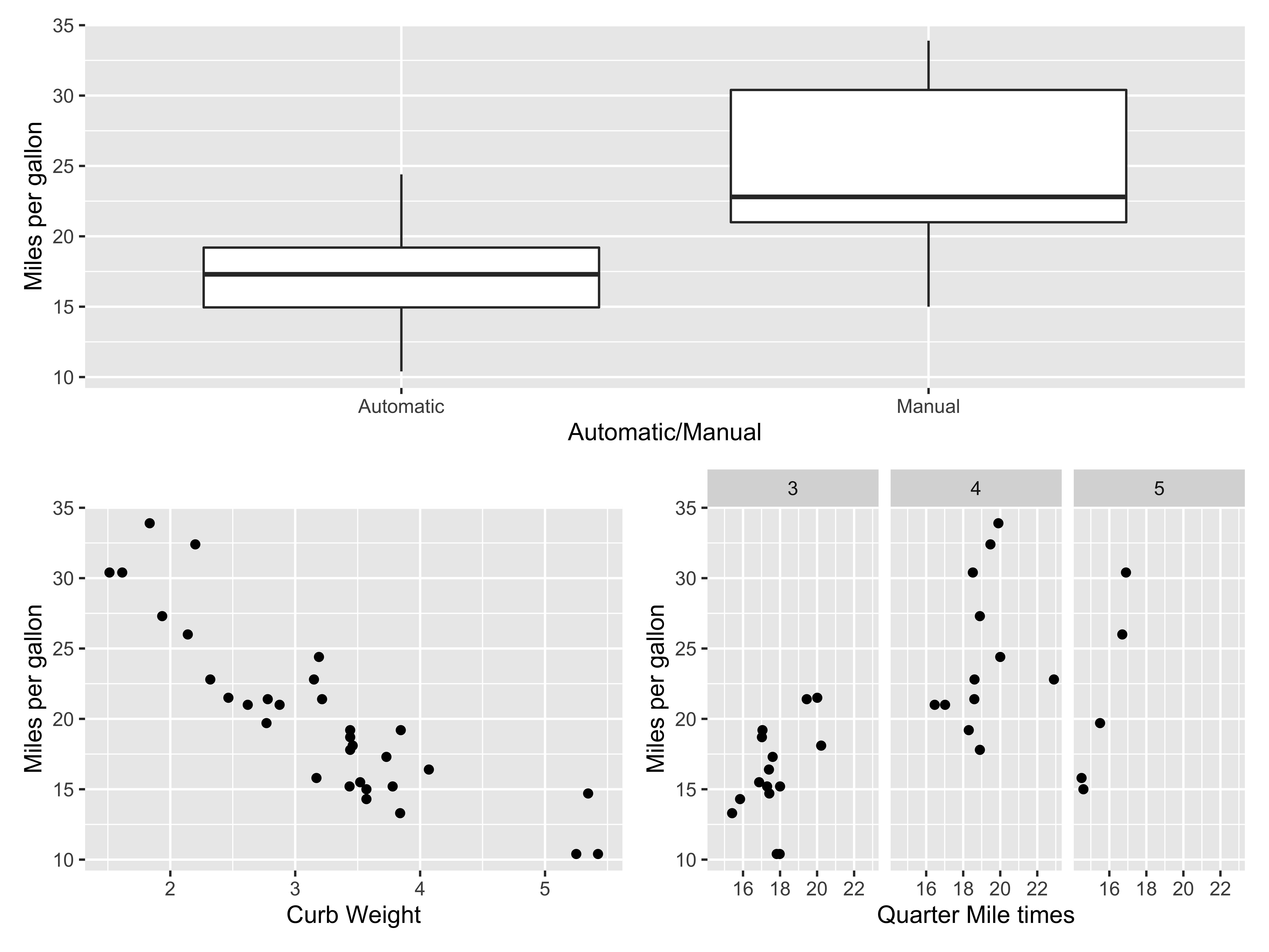
(p1 | p2 | p1) / p3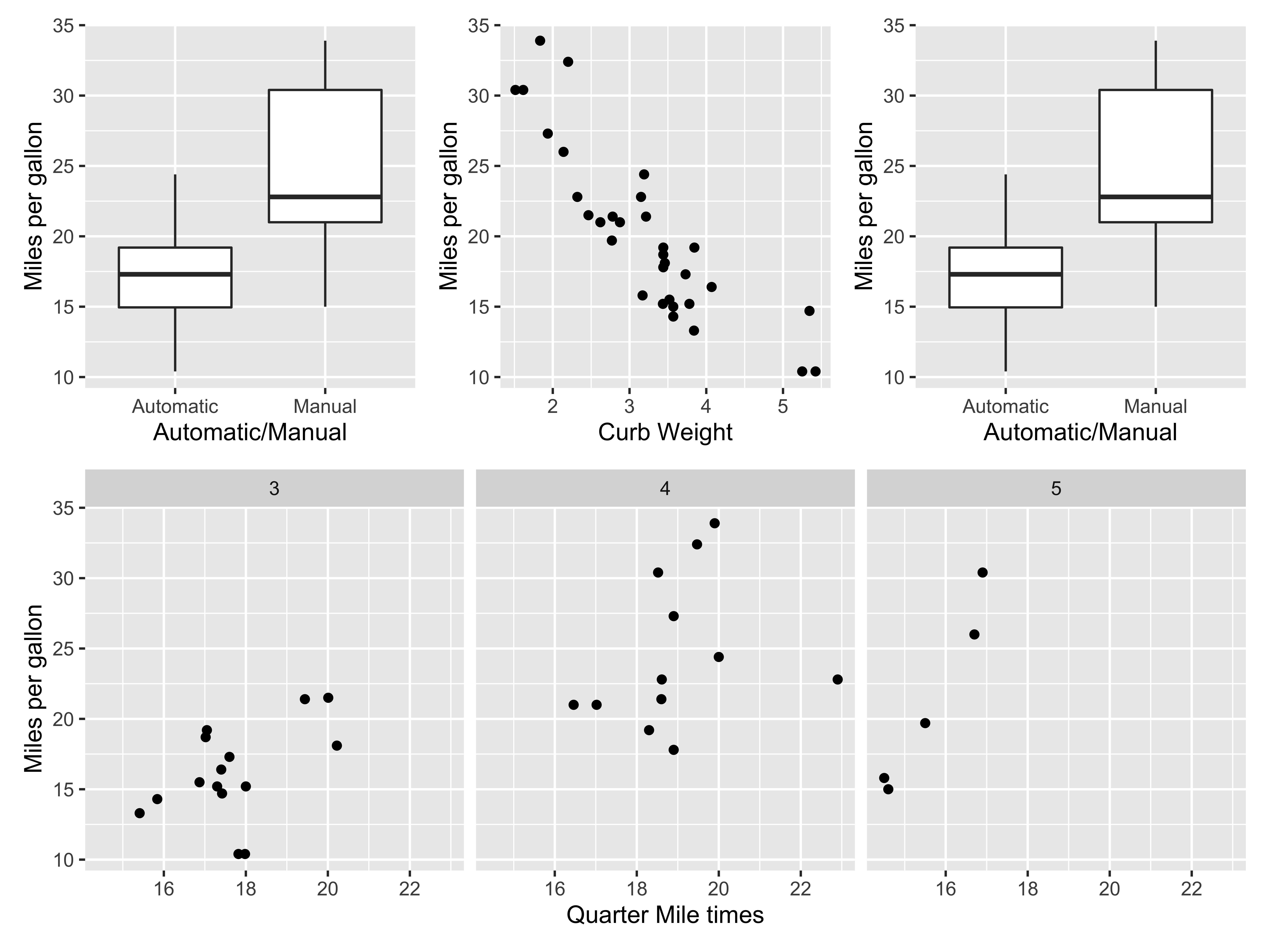
the | specifies vertical layouts and the / specifies horizontal layouts
(p1 + (p2 + p3) + plot_layout(ncol = 1, heights = c(1,2)))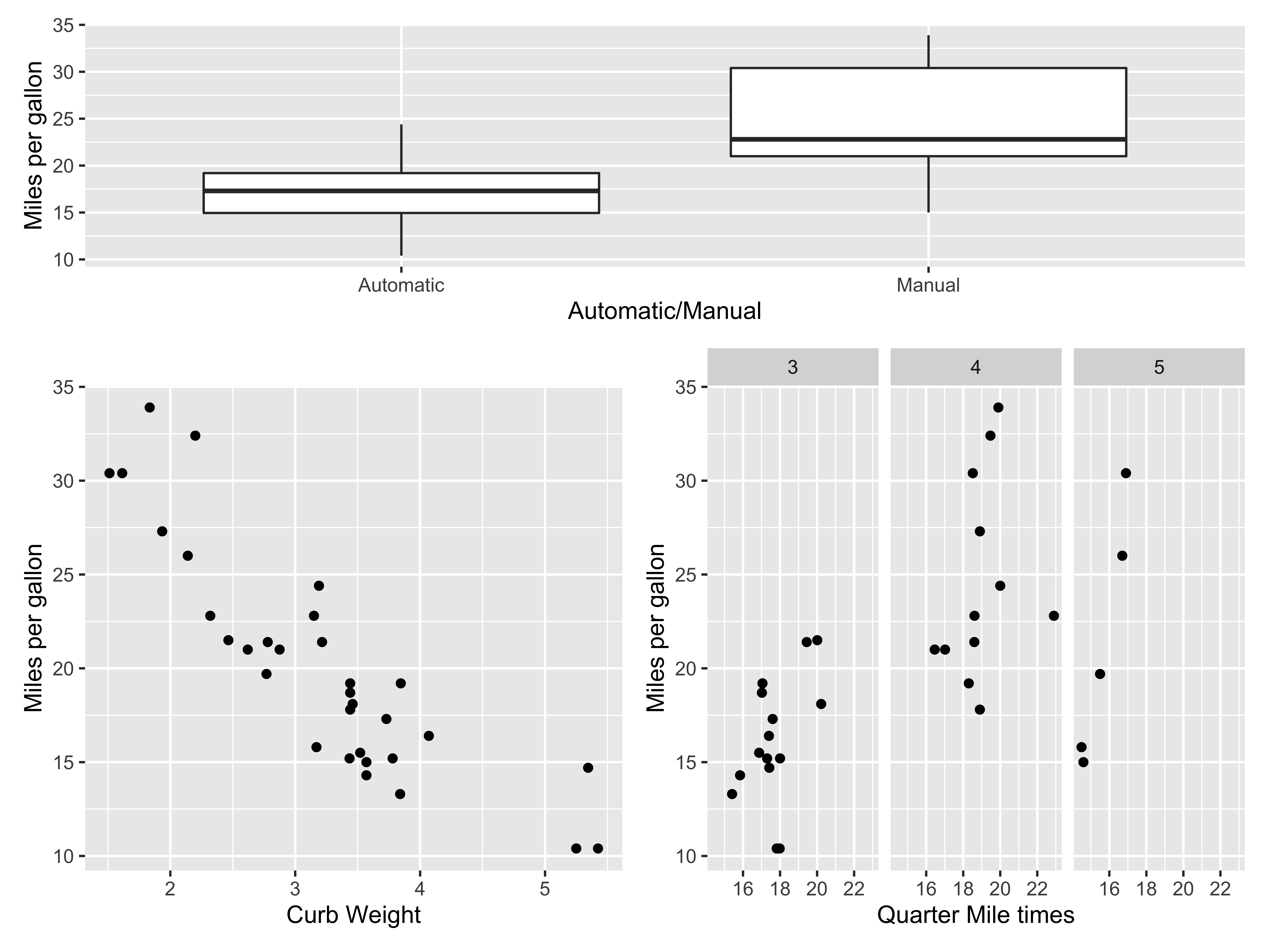
- see other settings here
- you can also explore
cowplothere
