Recent Posts

Ktel Attikis
Ktel Attikis runs buses from Marathon to Athens and points in between. This is a simple table to allow for quick look up of departure times. Be advised that [Source data](http://www.ktelattikis.gr/rafina_marathonas) could change, including for the [Rafina - Airport](http://ktelattikis.gr/en/rafina_airport) run. Marathon, Nea Makri, Rafina, Athens 'downtown', and the Athens Airport are reachable by bus with patience. The fare from Marathon - Athens is 3.70 euros, paid in cash. The bus conductor has change but might be better to have reasonably denominated currency notes.
Area Deprivation Indices
Staying on course with our exploration of social determinants of health (SDOH), next up are the area deprivation indices (ADIs). The basic idea behind the ADI, first formulated two decades ago and refined a couple of times since, is to utilize a well-defined set of socioeconomic indicators for all geographies and then generate a relative index of deprivation that allows one to compare and even rank geographies in terms of greater/lesser socioeconomic status.
AHRQ's Social Determinants of Health Data (beta)
"An integral part of delivering high-quality healthcare is understanding the social determinants of health (SDOH) of patients and of communities in which healthcare is provided. SDOH are defined by the World Health Organization (WHO) as the conditions in which people are born, grow, live, work and age." (Source: AHRQ)
The Atlas of Rural and Small-Town America
USDA's Economic Research Service releases a lot of state- and county-level information on various socioeconomic and demographic attributes of the population of these geographies.

Measuring Community Resilience
Given the somewhat recent emphasis on social determinants of health (SDOH), the last few years have seen a sharp increase in the number of indicators and data-sets that tap one or more SDOH measures. One such series, Census-generated, is the community resilience data, with reslience defined as "the capacity of individuals and households to absorb, endure, and recover from the health, social, and economic impacts of a disaster such as a hurricane or pandemic." In this post I explore these data to better understand what they may tell us.

Ethnic and Linguistic Diversity in Ohio
We are seeing heightened awareness of, and interest in, health disparities experienced by our Buckeye state denizens. What groups are of interest in these conversations? Certainly, income and poverty-threholds matter, as do race and ethnicities. But linguistic and other differences that are the lived experiences of the foreign-born are often overlooked. As such, in this post I simply tabulate and visualize a few Census-based indicators of these disparities. The analyses are simple by design, intended merely to shine a spotlight on specific patterns.
Vulnerabilities and Vaccination Rates in Ohio Counties
On March 26th the CDC released county vaccinate rate estimates for the nation, indicating daily updates would be released around 8:00 pm EST. I will be trying to update this daily in sync with the CDC, and looking at vaccination rates in the context of social vulnerability indices.
Race and Income in Ohio's Populous Cities
Orman (Hall) and I were chatting about bivariate choropleths and not having written something new in a while, I figured this was a reason to build one with {biscale}. The focus here will be on the largest cities in Ohio. We start by looking at Census tracts within all 88 counties, and then zeroing in on Census tracts within the largest cities.

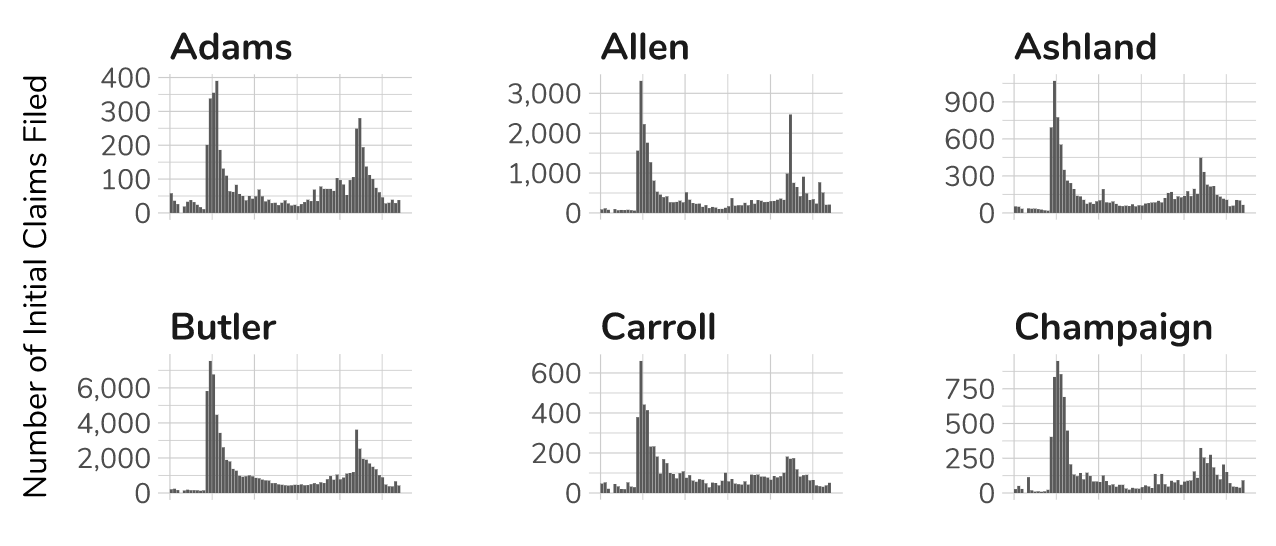
Initial Unemployment Insurance Claims Filed in Ohio's Counties
A few weeks ago I was bemoaning the fact that the state was not releasing the weekly county-level initial and continued unemployment insurance claims data in anything but an old pdf format. How old you ask? You know, the kind the Census Bureau gave up in the 1990s.
Congressional Districts Over the Years
Redistricting season is here, now that the U.S. Bureau of the Census has released the 2020 census apportionment data. As mapmakers clean their quills and the political parties sharpen their arguments, it would be interesting to see how Ohio's districts have shaped up over the years.

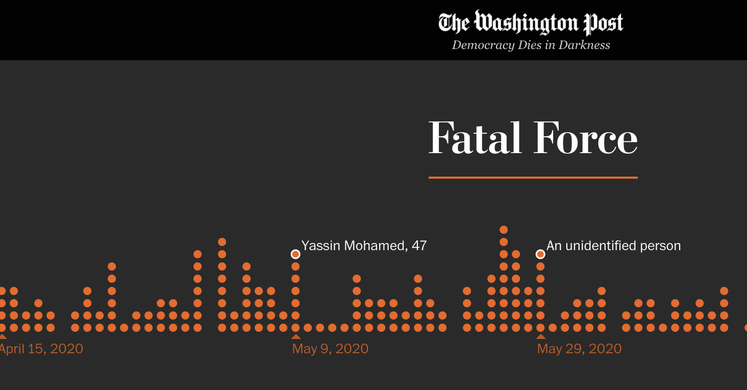
Fatal Police Shootings in Ohio
Since 2015, The Washington Post has been logging every fatal shooting by an on-duty police officer in the United States, motivated primarily by the realization that the FBI database tends to underepresent fatal police shootings by more than half (because all police departments do not report all shootings).
COVID-19 Vaccination Progress
The CDC is tracking overall vaccination rates and longterm-care facilities' vaccinations, both by State, Territory, and the former also by Federal Entity. This is a simple post using {statebins} to track change over time.

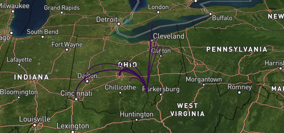
Migration Flows and Tidycensus
{tidycensus} now includes migration flows and boy is this exciting! Tapping Census data is becoming easier by the month, literally. Being so Ohio and Athens-focused I figured it would be nice to see where Athens' citizens came from. It would be even more interesting to look at some of our other counties and metropolitan areas.
Making Friends with {gtsummary}
While I have some inkling of how {gt} works fresh in my mind, it would be good to also come to grips with {gtsummary}, so here we go on another journey! From a cursory reading of examples I have seen it is a promising package that may replace {stargazer} (one of the workhorses I have come to love).
{gt} Tables (2/2)
In the preceding post, I began exploring basic formatting of {gt} tables. In this post I want to look at the coloring options, cell borders, and custom fonts.
{gt} Tables (1/2)
The {gt} package -- yes, you guessed it, gt stands for The Grammar of Tables -- has been around for a while but I have never used it thus far. I have started seeing it used more often in the #rstats world and decided to give it a try.
Changing the Legend Title in a {ggplot2} geom
This came up in class this past week and here we are: In how many ways can I change thee, oh legend title? It doesn't matter what data we use; the Ikea data from 2020's TidyTuesday are used here.

Testing ipynb to markdown in distill
Having migrated my site from hugo Academic to {{distill}} I wanted to see if I could fold-in python rendered notebooks with ease, and what the results would look like. Suffice it to say the process has been painless so far ... create the usual Rmd for the post >>> export the ipynb notebook from **jupyter** as a markdown file (.md) >>> copy-and-paste md file's content into the post's Rmd file.
How is this different from the last recession?
Someone well-meaning asked me why I thought the current economic crisis might be different from the last recession, and why might we not see the recovery patterns from the 2009-2012 period. I suppose I feel it is different because of everything I read about the state of the economy these days, and because the one number I can chart -- the unemployment rate -- is not even close to what we have witnessed since 1948.

The Homeless Today
Every year the U.S. Department of Housing and Urban Development (HUD) releases the Annual Homeless Assessment Report to Congress (AHAR) in two parts. Part 1 provides Point-in-Time (PIT) estimates, offering a snapshot of the homeless (both in shelters and unsheltered) during the last 10 days of January. These estimates are rolled out for `Continuums of Care (CoC)` -- local planning bodies responsible for coordinating the full range of homelessness services in a geographic area, which may cover a city, county, metropolitan area, or an entire state. The preview image is from Dimi Katsavaris, courtesy of Unsplash.
Tracking COVID-19 in Ohio's Counties
The New York Times is releasing a series of data files with cumulative counts of coronavirus cases in the United States, at the state and county level, over time. They are compiling this time series data from state and local governments and health departments in an attempt to provide a complete record of the ongoing outbreak. This is a map built with their data and updated (almost) daily to track progress in Ohio's counties. The values displayed in the first heatmap are the weekly cumulative number of cases per 10,000 persons (the population estimates are from the 2015-2019 American Community Survey). Preview image is Brian McGowan's, courtesy of Unsplash.
TSA Throughput with Scraping html Tables
I saw one of the smartest people I know of (the one and only @hrbrmstr) post TSA's daily airline passenger traffic numbers circa March 01, 2020 and later, and the corresponding numbers for the same dates albeit in 2019. The data source is an html table, and since I haven't scraped html tables in a while, I wanted to get rid of the cobwebs. Surprisingly easy but then the TSA data source-page is a very clean setup.

Unemployment in Ohio's Counties
It has been a while since I created a new post and although there have been a few in the pipeline, I cannot find the peace of mind to sit down and work through them to create something worthwhile. To assuage the feeling of falling behind, here is a quick post tracking unemployment rates in our counties. The data are from the Bureau of Labor Statistics. Preview image is by Dorothea Lange, courtesy The New York Public Library and Unsplash.

Appalachia: A Profile in Numbers
The founding report of the Appalachian Regional Commission does a wonderful job of highlighting the state of affairs in Appalachia circa 1950 and 1960. The prose is not too shabby even if it careens every now and then into the romantic: "Graphs and tables can hardly relate the acutely personal story of a child in a remote valley, his horizon of opportunity limited to the enclosing hills; nor the despair of his father, who, idled by forces beyond his control and seeing no prospect of future employment, must live month in and month out with the vision of that child repeating his own history. This report can only present statistical evidence, the inanimate pictures, and hope they are as convincing as the visitor to Appalachia finds the realities." Preview image by Jeff Miller, courtesy of Unsplash.

Income, Poverty, and Health Insurance in Appalachia
The Census Bureau's Small Area Income and Poverty Estimates (SAIPE) Program and the Small Area Health Insurance Estimates (SAHIE) Program are two of my favorite 'go-to' sources for small-area estimates. Both are easily grabbed via `tidycensus` so the first thing I'd like to do is explore county-level trends going as far back as is possible -- 2008-2018 for SAHIE, 2006-2017 for all SAIPE estimates except for school-age (5 to 17 in families) poverty rate estimates that allow for longer comparisons (2005-2017). Preview image by MJ Tangonan courtesy Unsplash.

Internet Access in Ohio's Census Tracts
Note: This is a quick post for colleagues who were curious about internet access in Ohio and so here we are. The data are from the 2014-2018 5-year American Community Survey, and all estimates are for Census Tracts. I suppose at some point I should expand this to include the counties, perhaps even cities, towns, townships, etc. Preview image by Ludovic Toinel, courtesy of Unsplash.
Resident Population Change in Ohio
Now that the population change estimates are out, here is a quick peek at Ohio's estimates. First up -- the extent of gains and losses in our counties. No surprises here; Most of the Appalachian counties have seen population losses. Specifically, Appalachia lost 48,211 persons while the rest of the state gained 200,896 persons. The largest gains were in Franklin (146,768), Delaware (30,654), Warren (19,353), Hamilton (14,312) and Butler (14,243). The greatest losses were in Cuyahoga (36,258) and Lucas (11,916).
Opioid Encounters in Ohio Counties
The opioid crisis is an issue in most parts of the country and Ohio is no exception, with some of the highest numbers of Fentanyl encounters reported by law enforcement. Although one could, I suppose, try to identify county-level deaths due to drug overdoses via CDC Wonder, this is a quick look at the data provided by the Ohio Hospital Association's Overdose Data Sharing Program.

Estimating Disconnected Youth in Ohio
A client needed state-level estimates of the percent of opportunity youth (defined either as 16-19 or 16-24 year-old persons who are neither in school nor employed) in each state plus Washington DC. The end result would be three years of estimates that matched the numbers put out by Measure of America's yearly reports on the subject. I had used Anthony Damico's fantastic repository "Analyze Survey Data for Free" for BRFSS, DHS, and other data but never with the Census Bureau's Public Use Microdata Samples (PUMS) data. This was a golden chance to remedy that limitation, and in this short post I am documenting my experience.
Himalayan Expeditions
I am afraid that if I let time pass without writing steadily the stream of posts will dry up. To stave off that possibility here I am, taking a crack at understanding the expeditions. This is a fascinating database because it has a lot of rich detail that I want to run through before summer comes around. To keep the momentum I began by looking at the number and nature of expeditions to the Himalayan peaks. I began by looking at the 9,608 unique expeditions I see in the database.

Monitoring the Hocking River
The Hocking River that meanders through our town is under flood-watch. Things must be bad enough else why would the University cancel all classes for Monday. To whit: "A forecast for heavy rains and high winds have resulted in a flood warning for Athens County beginning this weekend into Monday. Based on current forecasts, specific areas on campus may be impacted by flooding Sunday evening into Monday morning. In addition to closed roadways and flooding on campus, there is a potential for high winds, which increases the possibility of widespread outages across campus, impacting power in residence halls, dining facilities and academic buildings."
Peaks First Climbed in the Himalayas: 1909-2017
I've been itching to get back into the himal database and Elizabeth Hawley's passing jolted me back into action. I wanted to start by looking at the peaks themselves, hoping this would give me a better understanding of the fields before I delve into the expedition data. We have data on 457 peaks, but only 377 are open and only 309 of these have been climbed. Information about the date of the summiting is missing for 3 peaks (we have the year and the month but not the day) so that drops the dataset down to 306 peaks.

The Himalayas
"You perfect a sport when you can do all of these things with less stuff. The most impressive ascent of Everest was by the Swedish guy who bicycled from Stockholm to Kathmandu and then soloed Everest and bicycled back to Stockholm. That is cool, as opposed to this huge multinational guided thing with computers and internet cafes at the base of Everest." – Yvon Chouinard
Census 2020 Response Rates
COVID-19 may have been impartial in that it has affected just about every facet of our lives but its decade-long impact is likely to manifest itself in a larger Census undercount in some areas than in others. In this post I wanted to take a quick look at how our fair state is faring (no pun intended). Let us start with a view from the eagles' crag -- looking at our Census Tracts. We start by downloading the 2010 and 2010 response rate data, respectively.
Ohio's COVID-19 Cases by Zip Code
Since the Ohio Department of Health is releasing case count data by zip codes, I wanted to see what this data looks like. There may be some questions that could be explored down the road. Time will tell.