This post was originally written on 2018-10-17
The opioid crisis is an issue in most parts of the country and Ohio is no exception, with some of the highest numbers of Fentanyl encounters reported by law enforcement. Although one could, I suppose, try to identify county-level deaths due to drug overdoses via CDC Wonder, this is a quick look at the data provided by the Ohio Hospital Association’s Overdose Data Sharing Program.
Note that the data reflect the number of visits and not the number of unique visitors, and county data are suppressed if the number of visits is less than 11 or if the county population size is under 20,000. The population size filter leads to no data for Harrison, Monroe, Morgan, Noble, Paulding, and Vinton counties.
library(readxl)
read_excel(
here::here("data/posts", "opioids.xlsx")
) -> mydf
library(tidyr)
opioids <- mydf %>%
gather(Year, Rate, 3:12) %>%
dplyr::mutate(Rate = as.numeric(Rate),
Year = as.integer(Year)
)I’d like to see what visualization works best with these data. Animated maps, with transition_time(Year) is okay but not very helpful here.
library(ggplot2)
counties <- map_data("county")
ohio <- counties %>%
dplyr::filter(region == "ohio") %>%
dplyr::mutate(County = stringr::str_to_title(subregion))
ohio.counties <- merge(ohio, opioids, by = c("County"), all = TRUE)
library(gganimate)
ggplot(ohio.counties, aes(x = long, y = lat, group = group)) +
geom_polygon(aes(fill = Rate), color = "black") +
coord_fixed(1.3) +
ggthemes::theme_map() +
theme(legend.position = "bottom") +
viridis::scale_fill_viridis(option = "magma", direction = -1) +
transition_time(Year) +
labs(title = 'Year: {frame_time}',
subtitle = "Opioid Overdose Encounters per 10,000 persons
in Ohio Counties: 2008-2017 /n (by County and Year)",
caption = "Author: @aruhil | Data Source: Ohio Hospital
Association's Statewide Database"
) -> p1
animate(p1)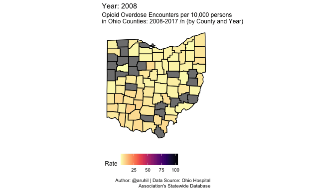
How about a gifski product?
ggplot(ohio.counties, aes(x = long, y = lat, group = group)) +
geom_polygon(aes(fill = Rate), color = "black") +
coord_fixed(1.3) +
ggthemes::theme_map() +
theme(legend.position = "bottom") +
viridis::scale_fill_viridis(option = "magma", direction = -1) +
transition_time(Year) +
ease_aes('quadratic-in-out') +
labs(title = 'Year: {frame_time}',
subtitle = "Opioid Overdose Encounters per 10,000 persons in
Ohio Counties: 2008-2017 /n (by County and Year)",
caption = "Author: @aruhil | Data Source: Ohio Hospital
Association's Statewide Database"
) -> p2
animate(p2, renderer = gifski_renderer())
Other alternatives come to mind as well: (i) static maps by year, (ii) small multiples of line plots per county, and (iii) a heatmap (perhaps with highcharter).
And now the small multiples of maps showing encounter rates by year …
ggplot(ohio.counties, aes(x = long, y = lat, group = group)) +
geom_polygon(aes(fill = Rate), color = "black") +
coord_fixed(1.3) +
ggthemes::theme_map() +
theme(legend.position = "bottom",
strip.background = element_blank(),
strip.text = element_text(size = 10)
) +
viridis::scale_fill_viridis(option = "magma", direction = -1) +
facet_wrap(~ Year, ncol = 5) +
labs(title = 'Opioid Overdose Encounters in Ohio Counties',
subtitle = '(2008-2017)',
caption = "Author: @aruhil | Data Source: Ohio Hospital
Association's Statewide Database",
fill = "Encounters per 10,000 persons"
)
Now two highcharter visualizations, the first a heatmap and then a hover map of encounters in 2017.
library(highcharter)
library(viridis)
library(htmltools)
library(widgetframe)
fntltp <- JS("function(){
return this.point.x + ' ' + this.series.yAxis.categories[this.point.y] + ':<br>' +
Highcharts.numberFormat(this.point.value, 2);
}")
plotline <- list(
color = "#fde725", value = 2013, width = 1, zIndex = 5,
label = list(
text = "Encounters Spike", verticalAlign = "top",
style = list(color = "#606060"), textAlign = "left",
rotation = 0, y = -5)
)
op.df <- opioids %>%
dplyr::mutate(Rate = round(Rate, digits = 1))
hchart(op.df, "heatmap",
hcaes(x = Year, y = County, value = Rate)) %>%
hc_colorAxis(stops = color_stops(10, rev(inferno(10))),
type = "logarithmic") %>%
hc_yAxis(reversed = TRUE, offset = -20, tickLength = 0,
gridLineWidth = 0, minorGridLineWidth = 0,
labels = list(style = list(fontSize = "7px"))) %>%
hc_tooltip(formatter = fntltp) %>%
hc_xAxis(plotLines = list(plotline)) %>%
hc_title(text = "Opioid encounters per 10,000 (by Year)") %>%
hc_legend(layout = "vertical", verticalAlign = "top",
align = "right", valueDecimals = 0) %>%
frameWidget(height = '1200')data("unemployment")
oh.counties <- unemployment %>%
tidyr::separate(name, c("County", "stateabb"), sep = ", ") %>%
dplyr::mutate(County = gsub(" County", "", County)) %>%
dplyr::filter(stateabb == "OH")
op.df2 <- merge(op.df, oh.counties, by = c("County"), all = TRUE)
op.map <- op.df2 %>%
dplyr::filter(Year == 2017)
hcmap("countries/us/us-oh-all", data = op.map,
name = "Encounter rate", value = "Rate",
joinBy = c("hc-key", "code"),
borderColor = "transparent") %>%
hc_colorAxis(dataClasses = color_classes(c(seq(0, 10, by = 4), 12))) %>%
hc_legend(layout = "vertical", align = "right",
floating = TRUE, valueDecimals = 0,
valueSuffix = "%") %>%
hc_title(text = "Opioid encounters per 10,000 (2017)") %>%
frameWidget(width = '650', height = '650')Some more experiments are in the works because I think we can do some better narration here.