Photo by Alex Shute on Unsplash
In 2018 the Census Bureau released experimental estimates of
community resilience – “the capacity of individuals and
households within a community to absorb the external stresses of a
disaster.” These estimates were subsequently updated and released in
August of 2021, and have drawn the attention of policymakers and
stakeholders because of the ongoing COVID-19 pandemic.
In this post I take a closer look at them, with the goal of understanding how Ohio and Ohio’s counties compare to the rest of the nation, and of course zeroing in on our Census tracts as well. In the long-run this may lead to other explorations via the social vulnerability and area deprivation indices, respectively. Two estimates are of primary interest to me, (i) the percent of the population with one to two risk factors, and (ii) the percent of the population with 3 or more risk factors.
How are these risk factors estimated? The technical documentation points out that individual and household data are combined from the following metrics:
- Income-to-Poverty Ratio (IPR) < 130 percent (HH)
- Single or zero caregiver household - only one or no individuals living in the household who are 18-64 (HH)
- Unit-level crowding defined as > 0.75 persons per room (HH)
- Communication barrier defined as either
- Limited English-speaking households1 (HH) or
- No one in the household over the age of 16 with a high school diploma (HH)
- No one in the household is employed full-time, year-round. The flag is not applied if all residents of the household are aged 65 years or older (HH)
- Disability posing constraint to significant life activity
- Persons who report having any one of the six disability types: hearing difficulty, vision difficulty, cognitive difficulty, ambulatory difficulty, self-care difficulty, and independent living difficulty (I)
- No health insurance coverage (I)
- Being aged 65 years or older (I)
- Households without a vehicle (HH)
- Households without broadband Internet access (HH)
Each individual who meets a given risk criterion is assigned a binary value of 1 (0 if they are not deemed to be at risk for that criterion). These series of 0 and 1 values are then summed for each individual. Then the total number of individuals with 0 risk factors is calculated, followed by the total number with 1 or 2 risk factors, and then the total with 3 or more risk factors. Dividing by the population in the geography (state, county, etc) generates the percent of the population with 0, 1 to 2, or 3 or more risk factors. The 90% margin of error accompanies each estimate, and would be a good indicator of the uncertainty surrounding these estimates. As a benchmark, note that more than 65% of Americans have one or more risk factors (see Table 1). Note also that the smaller the percent of the population with 1 or more risk factors, the more resilient the community to fallout from a natural disaster, health pandemic, and so on.
How do the states fare?
Figure 1 shows the percent of each state’s population with 1 or more
risk factors. Minnesota tops the list, with only 56.1% of its population
with one or more risk factors, while New Mexico tails with 73.3% of its
population with one or more risk factors. Ohio is 13th (60.4%), doing
much better than most of the states.

The Counties?
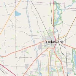
Surprise, surprise, Delaware (ranking 6th) is in the top-10 list of most resilient counties, while Warren also features in this marquee list (ranking 7th). Alaskan ‘counties’ feature very prominently in the bottom of the distribution (with six of the 10 least resilient locations).
| County | Percent | County | Percent |
|---|---|---|---|
| Carver County, Minnesota | 44.31 | Kusilvak Census Area, Alaska | 95.25 |
| Hamilton County, Indiana | 44.78 | Northwest Arctic Borough, Alaska | 92.81 |
| Scott County, Minnesota | 44.87 | Dillingham Census Area, Alaska | 92.39 |
| Hanson County, South Dakota | 44.95 | Todd County, South Dakota | 91.45 |
| Douglas County, Colorado | 45.41 | Oglala Lakota County, South Dakota | 91.20 |
| Delaware County, Ohio | 46.12 | Nome Census Area, Alaska | 90.71 |
| Warren County, Ohio | 46.39 | McKinley County, New Mexico | 90.69 |
| Dallas County, Iowa | 47.08 | Bethel Census Area, Alaska | 90.45 |
| Loudoun County, Virginia | 47.46 | Yukon-Koyukuk Census Area, Alaska | 90.29 |
| Forsyth County, Georgia | 47.63 | Apache County, Arizona | 89.56 |
What about the rest of our counties? How do they fare? To explore this question we turn to a static map that displays the percent of the county population with one or more risk factors.

As is quite evident from the map in Figure 2, there is quite a bit of variability across the counties. Compared to Delaware and Warren, both of whom have less than 50% of their population with one or more risk factors, all other counties have more than 50% of their population in this risk category. Monroe (70.3%) and Holmes (71.6%) have the most vulnerable populations, and so do Southeast Ohio counties.
Last but not the least – the Census Tracts!
In my experience, one of the problems with diving below the county level is that you start seeing blobs rather than anything too clear, particular in places with tightly clustered tracts. The map (see Figure, for example) illustrates this problem well; look at what is going on in Franklin, Hamilton, Cuyahoga, and so on. The one takeaway I would argue we could have faith in from this map is the heightened vulnerability of census tracts in Southeast Ohio.

To delve into variation within a county, let us look at the tracts in a few counties. I will start with Athens, just to see what is going on in my backyard. Lighter fill-colors indicate higher resiliency; please keep this in mind. Now, if you zoom in a bit and click on the map you should see the tract names and resiliency estimate popup. Look at Census Tracts 9730; is the east side of town where most of your faculty, staff, and other well to-do residents live. Note the reddish tract, Tract 9739.02; these are the less well to-do parts of town. The larger tracts are out in the country, as they say, and sparsely populated, with a mix of everything from mobile homes to large several acre residential properties.


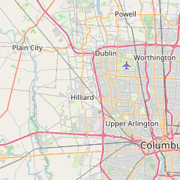
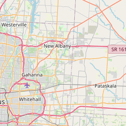
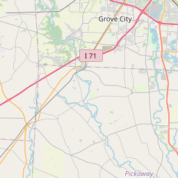
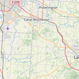
Okay, now that we have had a feel how these maps operate, why not look at tracts in each of the six largest counties in our state. If you are familiar with some of the places and neighborhoods in these counties, zoom in and explore the distribution of vulnerable tracts. As you see some pattern, no doubt you will wonder how race and ethnicity factor into this story. That is, are the more vulnerable tracts also the ones more likely to be home to larger proportions of minority Ohioans?